There’s nothing more frustrating than seeing site traffic but not seeing them turn into a website conversion. Many times, the first thought that takes place is “My marketing campaign isn’t working”. But, that’s not always the case! Is it possible that your website is sabotaging your lead generation strategy?
Trust is judged in less than a second. With the amount of information consumers are taking in nowadays through social media channels; the amount of time you have to capture their attention and build a line of trust has decreased tremendously. Your home page should tell your visitors 3 things: Who you are, what you offer, what’s in it for me?
After you have those questions clearly answered on your home page, the next step is to inspect your website for 6 Sneaky Website Conversion Killers:

#1: No Hook in your H1 tag
Your H1 tag has a job. It’s to make sure your reader doesn’t have a reason to leave. Your image and H1 copy should go hand in hand to form that first judgment from the visitor. The hook is the reason to keep going.
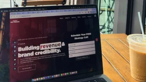
#2: Filler Hero Image
Take advantage of the visual real estate your website offers above the fold – meaning before someone has to scroll to see more of your website. Don’t just choose a pretty picture and catchy tagline. Your hero image shouldn’t create more questions than answers.
What you can do instead is connect the visual to the message, pain point or call to action of the H1 tag for powerful resonance. You could also reiterate your message or complement it with visuals. Or, don’t use a homepage image at all, and instead focus on a powerful message and call to action to keep your visitors focused on.
#3: No Value Proposition
Your value proposition should live in your sub-heading. Make sure your H1 tag grabs the audiences attention, and your sub-header sells your visitors on WHY they need your product or service. Instead of using too high-level, generic benefits or call to actions, you could phrase your value props like this:
“Get [specific desired outcome] with [specific features]”
“[1-3 specific desirable action verbs] with the only [product category unique selling proposition]”
“The only [product category] that [1-3 specific desirable actions]”
Now, when you are putting these together – avoid using broad verbs, or features and unique selling propositions that many others promote in the industry.
#4: Careless Pop-Ups
Pop-Ups work great, but careless pop-ups will 100% annoy your visitors and de-rail their first impression. They need to be carefully triggered with the right value proposition and call to action.
So, what makes a pop-up careless?
- Pops up too soon
- Your pop-up has no context
- There’s too many pop-ups
- Your pop-up is vague and difficult to exit from
Remember to consider the timing of your pop-up and place them carefully!
#5: Your Button Design
Have you ever gone to a website and are met with too many buttons, of all different colors and sizes? Choose just one type of button throughout your page. The less confusion, the more a consumer continues to trust your company.
When there are too many options, or too many colors – it doesn’t signal to the reader what the most important action is. If they’re too small, your visitors may not find the call to action important. Too many buttons can seem scammy and may scare visitors away, and lack of consistency with your buttons can cause cross-channel confusion.
How can you analyze your site for effective buttons? The Squint Test! That’s right, it’s exactly how it sounds. Sit back, pull up your website and squint – Can you tell what is being asked of you? Do you know how to take the next step? Make sure your buttons are big, bright and consistent across pages.
#6: Bad Button Copy
Vague language in general will not drive website conversions. Be as specific as possible while painting the context to the action tied to the button click. As an example, instead of just “Learn More”, use “Learn more about our services”.
By taking away the friction from the click, you’ll be able to yield more meaningful clicks without driving up your bounce rates. Remember, your button copy should be specific to the next step. So, if your button says “Buy Now” which navigates to the product page – you may want to consider changing it to “Add to Cart” or “View Product” because it’s likely the user isn’t ready to buy yet.
Overcome Website Conversion Killers with Expert Web Design in NJ
Now that you know what to look for, it’s time to test your website performance and see where improvements can be made. Don’t worry – we’re here to help! Schedule a free strategy session with our team today and let us show you how we can increase traffic and website conversions.
Identifying and addressing conversion killers is just the first step. To truly optimize your website, it’s crucial to have a design that not only avoids these pitfalls but actively encourages visitor engagement and conversions. At Adapting Social, a web design agency NJ that specializes in crafting user-friendly, conversion-focused websites tailored to your business needs. Our team of experts is dedicated to turning your website into a powerful tool that drives results. Reach out today to learn how we can help you eliminate conversion barriers and elevate your online success.